Masthead/ Logo
I feel that the masthead I have included on my
DVD cover is eye catching and easy for my target audience to read and
recognise. I have kept the masthead simple yet effective as the DVD cover is already
very busy and I don’t want to clutter it with a big bold logo from my
programme. I have broken typical media conventions associated with mastheads at
the top of DVD and magazine covers as I have placed it at the bottom of the
cover. I decided to place the masthead at the bottom of the cover so that the
main focus is on the images above this is because my target audience is young
children and they tend to be drawn in more by photos rather than text, so when
on the shop shelves the images are the first thing they’ll see. Finally the
simple serif font highlights the historic time travelling theme to the young
audience.
Target Audience
I feel that this DVD cover I have designed is
clearly aimed at a younger audience, this is because of the large images on the front to catch their attention
and appeal to them . The Childish theme is carried throughout the cover as it
uses large images of the characters in different time periods to show the
audience what the TV programme is about. It is also clear that this DVD cover
appeals to a younger target market as it contains little text when explaining
episodes and instead uses corresponding mages that give the children a snapshot
of the episode ahead.
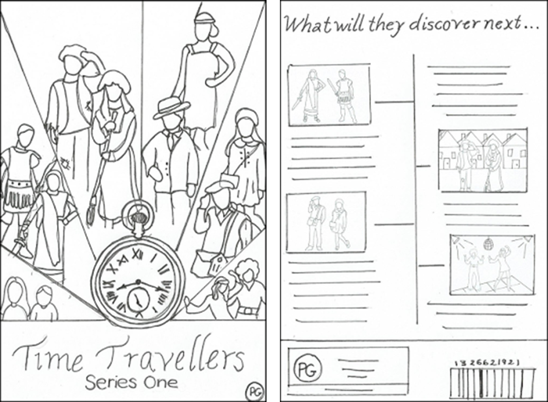
Layout
The Layout used for this DVD cover follows
typical media conventions for DVDs because , this magazine includes a clear
masthead so that it is easy to see on the shop shelves. The DVD cover also
follows conventions as it uses a photograph of the main characters which
clearly highlights their personalities and the plot of the programme . This is
effective as it makes the cover look appealing to its audience and gives them
an insight into what is in the DVD series is about. All the episodes are listed
on the back for them to see easily.
Typeface
The simple sans serif font I will be using makes
the writing easy and clear for the young target audience to read. By making the
font clear and easy to read allows the young audience to become independent in
reading by themselves, this then allows them to become interested in the DVD
and is easy for them to understand.
DVD Conventions
This DVD cover follows many media conventions
that are typically seen on other DVD covers covers on shop shelves. This DVD
has a clear barcode and a suitable age rating so that the audience can know
what age the programme is appropriate for. On the back it also lists all the
episodes the DVD includes which is a typical convention so that the viewer can clearly see what episodes the DVD includes.
No comments:
Post a Comment