
Wednesday, 16 March 2016
Sunday, 13 March 2016

Saturday, 12 March 2016
Friday, 11 March 2016
Editing - Magazine Cover
Photoshop
 When making my Magazine cover I found that Photoshop was a very helpful software to use. When Making my cover I wanted high quality professional looking photos and Photoshop helped me to achieve this. First I used the 'Magnetic Lasso' tool which allowed me to delete the bright green background. After removing the background I then used the 'Sponge tool' which allowed me to touch up any imperfections and make the image bright and of a high quality. I found Photoshop a particularly useful tool when making my magazine cover as I could achieve a professional looking photo that stands out on both my magazine and the shop shelves.
iStudio
 Once all the images were edited, I then used the iStudio software to make my magazine cover. I chose this software as it allowed me to create layers within my magazine so that I could overlap images and sub stories. iStudio also offered a variety of different textures filters for shapes, i chose the washed out letter fill as I feel that it tied in well with the WW2/evacuation theme. This therefore created a more professional and effective magazine cover than will stand out to my audience on the shop shelves. I also found that iStudio offers a variety of shapes that I can use to present my sub stories. For example, the 'soldier' sub story I used a half oval shape as I feel that is a similar shape to a bomb which again ties in with my WW2 theme.
Editing - DVD Cover
Photoshop
 When making my DVD cover I found that Photoshop was a very helpful software to use. When Making my DVD cover I wanted high quality professional looking photos and Photoshop helped me to achieve this. First I used the 'Magnetic Lasso' tool which allowed me to delete the bright green background. After removing the background I then used the 'Sponge tool' which allowed me to touch up any imperfections and make the image bright and of a high quality. Photoshop also allowed me to crop images so that they will fit the shape of my DVD cover. I found Photoshop a particularly useful tool when making my magazine cover as I could achieve a professional looking photo that stands out on the shop shelves.
iStudio
 Once all the images were edited, I then used the iStudio software to make my DVD cover. I chose this software as it allowed me to create layers within my magazine so that I could overlap images and sub stories. iStudio also offered a variety of different textures filters for shapes, I chose the washed out letter fill as I feel that it tied in well with the WW2/evacuation theme. This therefore created a more professional and effective DVD cover, I also used the same fill on my magazine cover so that they tie in together. Finally iStudio allowed me to fit my images to specific shapes so that I could create the overall split image that I wanted.
 When making my DVD cover I found that Photoshop was a very helpful software to use. When Making my DVD cover I wanted high quality professional looking photos and Photoshop helped me to achieve this. First I used the 'Magnetic Lasso' tool which allowed me to delete the bright green background. After removing the background I then used the 'Sponge tool' which allowed me to touch up any imperfections and make the image bright and of a high quality. Photoshop also allowed me to crop images so that they will fit the shape of my DVD cover. I found Photoshop a particularly useful tool when making my magazine cover as I could achieve a professional looking photo that stands out on the shop shelves.
 iStudio

Editing - Title Sequence
To Edit and create my title sequence I used the software iMovie. iMovie allowed me to create a variety of short clips using green screen technology and other features. Editing was a long laborious process as I had to make several little clips in order to make my title sequence. For
 example, when the children's costumes are changing at the start of the sequence I had to make a smaller clip in order for it to work and look professional. I feel that using green screen technology has been a very useful feature when editing as I have been able to use backgrounds that i feel clearly represent the theme and time period in which the children are in.
Picture within Picture Editing
Also when introducing the characters I again had to make several smaller clips, this was because of the picture within Picture format, this feature allowed my to place smaller clips within my bigger clip however, it would only let me place one at a time and I wanted three clips. In order to achieve what I wanted I had to keep saving the video each time so that I could put another smaller clip on top of it. This was a long process, however I feel that it was highly successful as it has allowed me to follow a typical media conventions of introducing characters with corresponding images.
 Transitions
From previous research I found that transitions would be highly successful in my Title sequence as they are eye catching and especially appealing to younger audiences. When Editing iMovie allowed me to incorporate some transitions in order for the scenes to flow into each other professionally. At the beginning of the Title sequence I used the 'Circle Open' Transition, this allowed me to clearly emphasize to the audience that the radio caused the children to time travel as I used a close up of the radio which then turned into the children travelling.

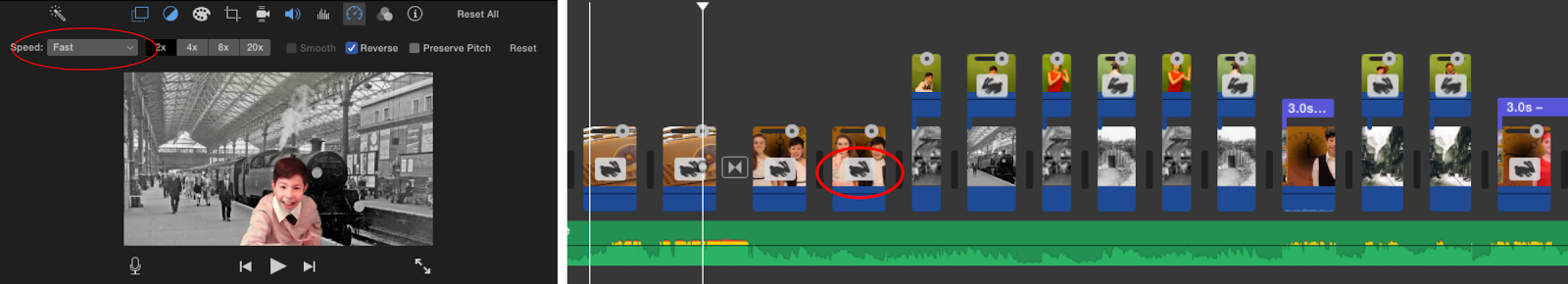
Speed Changes
From previous research I also found that iMovie allowed me to not only change the speed of clips by also reverse them. For my title sequence I used this feature many times, most recognizably when the male character throws his 1920's hat at the camera and it then comes back to him as a different hat. When Editing this clip I not only reversed the second clip but I also sped them both up, this is so that I could keep the title sequence Fast paced and exciting. Throughout my Title sequence I used the speed tool that iMovie offered as it allowed me to create the fast paced and engaging title sequence I was aiming for.

Text Tool
Finally when editing iMovie allowed me to place text over several clips, when editing I found that I could place text over clips that faded in and out. I thought this feature was particularly useful when creating the scene that introduced the characters. I used this feature to shows the audience the Children Names in the Program, I also chose the 'Chalkboard' font as i think that it fun and appealing to children of my age group. I found that this font appeared more child friendly and was also easy for them to read.


Picture within Picture Editing
Also when introducing the characters I again had to make several smaller clips, this was because of the picture within Picture format, this feature allowed my to place smaller clips within my bigger clip however, it would only let me place one at a time and I wanted three clips. In order to achieve what I wanted I had to keep saving the video each time so that I could put another smaller clip on top of it. This was a long process, however I feel that it was highly successful as it has allowed me to follow a typical media conventions of introducing characters with corresponding images.

From previous research I found that transitions would be highly successful in my Title sequence as they are eye catching and especially appealing to younger audiences. When Editing iMovie allowed me to incorporate some transitions in order for the scenes to flow into each other professionally. At the beginning of the Title sequence I used the 'Circle Open' Transition, this allowed me to clearly emphasize to the audience that the radio caused the children to time travel as I used a close up of the radio which then turned into the children travelling.
From previous research I also found that iMovie allowed me to not only change the speed of clips by also reverse them. For my title sequence I used this feature many times, most recognizably when the male character throws his 1920's hat at the camera and it then comes back to him as a different hat. When Editing this clip I not only reversed the second clip but I also sped them both up, this is so that I could keep the title sequence Fast paced and exciting. Throughout my Title sequence I used the speed tool that iMovie offered as it allowed me to create the fast paced and engaging title sequence I was aiming for.
Text Tool
Finally when editing iMovie allowed me to place text over several clips, when editing I found that I could place text over clips that faded in and out. I thought this feature was particularly useful when creating the scene that introduced the characters. I used this feature to shows the audience the Children Names in the Program, I also chose the 'Chalkboard' font as i think that it fun and appealing to children of my age group. I found that this font appeared more child friendly and was also easy for them to read.

Style of Camera Work
Extreme Close Up
 At the beginning of the title sequence I used an extreme close up shot of the radio this was because, I wanted to capture the radio and make it clear that it is the radio that makes the children time travel. I also then zoomed quickly out of the shot to build up the pace of the title sequence, i liked the effect this created as it further highlights the time travelling element to the young target audience. This camera shot with the addition of my chosen transition flows nicely into the next shot as it again adds the overall feel that the children are time travelling.
Middle/long shots
Throughout my title sequence I mainly used middle and long shots, this was because I wanted to make sure I included the background and the characters costumes. This is so that the audience can clearly see what time period they are travelling in. I used this camera shot at the beginning of the sequence when the children are starting to time travel, I also used this shot when introducing my characters as I again wanted to include their full costumes and the background. Although a simple shot, I think this camera shot has been highly successful in my Title sequence as it allows the audience to see both their costumes and the time travelling background so that the theme is clearly emphasized.

Set backs
There were several set backs in the production of my title sequence, the main one being the lighting and green screen technology. When filming the last scenes the lighting appeared bright and okay but I did not take into account shadows that will show up on the green screen. This then went on to effect the overall quality of the clip as the green screen background dulled down the overall quality and sometimes effected the models skin tone. I tried to fix this issue by using a tool on iMovie called 'Match colour', this allowed me to achieve a similar lighting from other scenes in the sequence. Although this tool balanced out the skin tone of the characters it then ruined the effect of the green screen as it altered the colour and bought out the creases in the green screen. As you can see in the images below the characters skin tone goes red and blurry so it is not as clear and professional as previous scenes.

Thursday, 10 March 2016
Time Update
Here I have evaluated whether I have stuck to my time plan so far, Keeping to my time plan is crucial for the development of this project as I do not want to fall behind because my work will become rushed and not to the best of my ability.


DVD Cover PlanMagazine cover PlanTitle sequence MockMagazine Mock UpDVD Mock UpDVD audience FeedbackMagazine Cover FeedbackTitle sequence FeedbackHair and Make UpFilming
Title Sequence Mock Up - Audience Feedback
 Here I have collected together some feedback on the title
sequence I made for my children’s TV drama ‘Time Travellers’, I asked 8 members
of my target audience to comment on the positives and negatives of the cover.
They also helped me with suggesting improvements I can make so that it is more
appealing to my chosen audience.
Here I have collected together some feedback on the title
sequence I made for my children’s TV drama ‘Time Travellers’, I asked 8 members
of my target audience to comment on the positives and negatives of the cover.
They also helped me with suggesting improvements I can make so that it is more
appealing to my chosen audience.
‘I like the title
sequence I think that it is fun and energetic, however, I feel that the
lighting is quite poor which can make it appear quite dull at first glance. I think
that if you improve the lighting quality the title sequence will be a lot more
appealing for this audience.’
‘I like all the characters different costumes that represent
the time period they are in, I like how when they are time travelling at the
start the viewers can see all their different outfits.’
‘overall I like the title sequence however, I think some
parts are a bit repetitive. For example, when the girl is turning and her
costume is changing. I think that it all appears quite similar maybe you could
include more of a variety of camera shots.’
‘I really like the music for this title sequence, I think
that it is fun and exciting for the views as its fast pace is stimulating and
getting them ready for they hectic program ahead. I also like the way the radio
changes at the start as it shows the viewers that this is how they time travel’.
‘I think there should be more of a variety of backgrounds, I
think they all look very similar, this makes the title sequence appear quite
boring and repetitive’.
‘I like the way the characters are introduced with small
clips next to them showing their personality and some features of the program,
however I think it is a bit brief ‘
‘I really like the camera shot where the boy throws his hat
and it changes into a different time period I think that is something different
compared to other title sequences. I like these type of shots as they are fun
and different to the stuff that is usually on TV.’
‘Overall I like this title sequence as it appeals to both
young boys and girl, however I think some parts are slightly repetitive so
maybe you could include more of a variety of camera shots to capture the views attention’.
To Conclude
From this audience research I have found out a lot regarding
the title sequence I made, many children commented on the fact that the
lighting is not very good which results in it looking boring and dull. This will
then instantly turn them off the program as they want to watch something fun
and exciting, title sequences are made to capture the audience’s attention but
if it looking boring viewers will turn over. Many children also commented on
the fact that a lot of the camera shots are quite repetitive, to improve this I
will practice with the different types of shots and camera work so that I can
create a fun and eye catching title sequence. Overall I feel that the feedback
for title sequence has been quite mixed, maybe this was because I didn't stick
to my original design that was successful amongst my target audience. For title
sequence I will take this criticism on board so that I can make a professional
yet fun and eye caching title sequence that will capture my audience’s
attention, I will include a variety of camera shots and make sure the overall lighting
is much better.
Subscribe to:
Posts (Atom)