Thursday, 25 February 2016

Title Sequence - Mock Up

Here I have analysed my Title sequence mock up for my children’s TV drama ‘Time Travellers’, I made this title sequence using iMovie, this software was very useful as It allowed me to use green screen technology and edit the speed of my clips.
Target audience
I think this title sequence clearly represents my target audience; I achieved this by incorporating both male and female characters that were of a similar age to my target audience. I chose to use characters of a similar age as it not only represents the target audience instantly but it also allows the audience to engage with the program and relate themselves to the characters. My target audience is also represented through the pace of the title sequence, the title sequence I have made is very faced paced, energetic and exciting. This represents my target audience as they are young children who are energetic and overexcited, it also represent the overall feel of the TV program. My program will be exciting and fast paced to keep the viewer’s interested and I think my title sequence clearly represents this.
Camera shots
For this title sequence I have mostly used long/medium shots, this is because I wanted to makes sure the audience could clearly see the characters costumes which represent the time period they are in. I feel that for my real Title sequence I need to incorporate a larger variety of camera shots so that it remains interesting and fun for the viewers. However there are some camera shots that I particularly like which iMovie have allowed me to create, I particularly like the shot where the male actor throws his hat at the camera and in the next scene he is a different costume. I think that this shot is highly effective as it is different to other camera shots used in title sequences already on television.
Conventions
I think that in this title sequence I have created I have followed many media conventions associated with title sequences. For example I feel that my title sequence explains the plot of the program clearly as it shows that the radio causes the children to time travel at the beginning. Also my title sequence clearly introduces the two main characters, similar to the ‘MI High’ title sequence I analysed I have used corresponding clips to highlight the characters personality. The final convention I feel that I have followed is at the end of the title sequence when the programs logo is revealed, I think this convention is highly important as it allows the views to see what the program is called, it also creates more of a relaxed feel for the beginning of the program.

Lighting
I feel when filming I did not take lighting into account; this has resulted in a poor quality title sequence that appears very dull. Not taking lighting intro account has also affected the quality if the green screen technology, as you can see the backgrounds can appear quite dark and blurry; this is because the lighting on the green screen was poor. When it comes to filming for my final title sequence I will take lighting into account as it has resulted in a poor quality and unprofessional looking title sequence.
Music
I Think the music for this title sequence is appropriate as it is fast paced and exciting, this will grab the young viewers attention. The fast pace music also conveys the fun and lighthearted theme of the program. Overall, I think that the music I chose was highly effective for my title sequence, as it clearly highlights my young target audience. 

DVD Cover Mock Up - Audience Feedback


Here I have collected together some feedback on the DVD cover I designed, I asked 7 members of my target audience to comment on the positives and negatives of the cover. They also helped me with suggesting improvements I can make so that it is more appealing to my chosen audience.

‘I like how the image is split into sections to show the different time periods however, I feel that it looks rather busy and cluttered. You could improve this by keeping the background images simple so that the focus is on the characters.’

‘I feel that compared to the busy and eye-catching image the title of the program looks quite boring and plain. Maybe you colour redesign some aspects of the logo to make it more eye-catching and memorable.’

‘I like the characters different costumes on the cover as it clearly show the different time periods they are traveling to. I like the main image on the cover however; I think it over powers the title slightly’.

‘I am not keen on the red background behind the text; I think that it distracts you from the title of the program. To improve this you could try using a duller colour maybe a grey or maroon, just so that the focus is on the title and image.’

‘I like how there is a girl and a boy character so that it appeals to both boys and girls. However, I think the red background may put some boys off as they associate it with girls. Maybe you could use a darker red that isn’t so stereotypical’.

‘I feel that the title is overpowered by the main image, to improve maybe you could change the layout of the DVD cover so that the title is at the top which makes it stand out more.’

‘I like the DVD cover I think that it is appealing to people of my age as the characters are a similar age. I also like the time travelling theme as it is fun and interesting to look at their costumes’.
To conclude
Many children commented on the contrast between the busy image and plain logo, when making my real DVD cover I will take this into account and as one child suggested I may have to change the layout. Many children also commented on the red background stating that it distracted them for the main image; I will also take this factor into account and will experiment with colours that will suit the cover better. When designing my DVD cover I will take this audience feedback into account as it is crucial for making sure that my DVD cover looks professional and appealing to my target audience.

Tuesday, 2 February 2016

DVD Cover - Mock Up

Here I have made some mock ups for my 'Time Travellers' DVD cover, I have used the software iStudio to make these and I have stuck to my original design. iStudio allowed me to fit my images to specific shapes which helps show the children in different time periods. I also think that dividing the page helps the image flow better helping to create the time travelling effect. Here I have shown the Development of making the DVD covers, my initial designs included no backgrounds however, when I made the first cover i felt that it looked very basic and unappealing to my young target audience. 

Masthead/ Logo
I feel that the masthead I have included on my DVD cover is eye catching and easy for my target audience to read and recognize. I have kept the masthead simple yet effective as the DVD cover is already very busy and I don’t want to clutter it with a big bold logo from my program. I have broken typical media conventions associated with mastheads at the top of DVD and magazine covers as I have placed it at the bottom of the cover. I decided to place the masthead at the bottom of the cover so that the main focus is on the images above this is because my target audience is young children and they tend to be drawn in more by photos rather than text, so when on the shop shelves the images are the first thing they’ll see. Finally the simple serif font highlights the historic time travelling theme to the young audience.
Target Audience
I feel that this DVD cover I have designed is clearly aimed at a younger audience, this is because of the large  images on the front to catch their attention and appeal to them . The Childish theme is carried throughout the cover as it uses large images of the characters in different time periods to show the audience what the TV program is about. The models used on the DVD cover also convey the young target audience as they too are young and a similar age. It is also clear that this DVD cover appeals to a younger target market as it contains little text and is largely image based. This image is especially appealing to my target audience as it appeals to both young boys and girls, this is seen through the models I have selected. 
Layout
The Layout used for this DVD cover follows typical media conventions for DVDs because , this magazine includes a clear masthead so that it is easy to see on the shop shelves. The DVD cover also follows conventions as it uses a photograph of the main characters which clearly highlights their personalities and the plot of the program . This is effective as it makes the cover look appealing to its audience and gives them an insight into what is in the DVD series is about. All the episodes are listed on the back for them to see easily.
Typeface
The simple sans serif font I will be using makes the writing easy and clear for the young target audience to read. By making the font clear and easy to read allows the young audience to become independent in reading by themselves, this then allows them to become interested in the DVD and is easy for them to understand.
DVD Conventions 
This DVD cover follows many media conventions that are typically seen on other DVD covers covers on shop shelves. This DVD has a clear barcode and a suitable age rating so that the audience can know what age the program is appropriate for. On the back it also lists all the episodes the DVD includes which is a typical convention so that the viewer can clearly see what episodes the DVD includes. 
Overall, I am yet to decide whether I prefer the red background behind the masthead, I feel that it slightly distracts the target audience from the busy image, creating a very cluttered overwhelming cover. However, I feel that without the background the bottom of the cover appears very plain and boring. To help me decide I will be asking my target market for their personal opinions on the cover and if there are any improvements I can make so that it appeals specifically to my audience. 

Saturday, 16 January 2016

Magazine Mock Up - Audience Feedback


Here I have collected together some feedback on the Magazine cover I designed for my Time Travelling program, I asked 7 members of my target audience to comment on the positives and negatives of the cover. They also helped me with suggesting improvements I can make so that it is more appealing to my chosen audience.

‘I think that the overall look of the magazine cover is slightly boring as it looks to educational. Maybe you could include more images and colours to attract the reader’s attention’.

‘I like the stamp that tells you what edition the magazine is, this makes it fun for the reader and would grab my attention when in the shop. I like how the stamp stands out and makes the magazine look less formal and educational.’

‘I think the font is easy for young readers to read and understand however, I think using the same font and colours across the cover makes it look boring and dull. Personally I think this cover would not stand out to me on the shop shelves.’

‘I think the main cover image is boring and unappealing, it does not grab my attention. I think that you need a fun and energetic image to grab the reader’s attention as images are the first thing you look at on the cover.’

‘Overall I think this cover appears a bit boring for this audience, there are no eye-catching, bold colours they are all very dull. For a children’s magazine I think you need to use bright bold colours that catch the reader’s attention when on the shop shelves.’

‘I think you need more sub stories and competitions to grab the reader’s attention, the sub stories at the moment are very hidden they do not stand out. I also think they are quite boring and unappealing for this target audience.’

‘I think the overall appearance of this magazine is quite boring, although you have made it clear and easy for young children to read I feel that it appears to educational looking therefore making it appear boring to young children.’
To conclude
From this audience research I have found out a lot regarding the magazine cover I made, many children commented on the fact that it looks dull and to educational. This will then instantly turn them off the magazine as they want to read something fun and exciting. Many children also commented on the fact that the main image is also boring and dull, to improve this I will practice with the different types of shots and camera work so that I can create a fun and eye catching image. Overall I feel that the feedback for my magazine has been quite negative, maybe this was because I didn't stick to my original design that was successful amongst my target audience. For my final cover I will take this criticism on board so that I can make a professional yet fun and eye caching magazine for my target audience. 

Friday, 15 January 2016

Magazine Cover - Mock Ups

Masthead
The masthead for this magazine will be the memorable and recognizable ‘Time Travellers’  Logo. This logo I have designed is very different from others as it is not as bold  as conventional mastheads because,I have used a Serif font however, I feel the masthead will still stand out on the shop shelves. The masthead uses colours  that I feel are associated with Time travel, for example the maroon and black colour scheme is typically associated with different time periods as it looks washed out and dated.  The typeface used is clear and easy to understand , this is useful for the young target audience as it is easy to read, the Time travelling theme is also shown through the colours and use of typeface as it is considered as an old fashioned/ classic font. By making it easy to read children will enjoy and take an interest in the magazine and reading.
Target Audience
This magazine I have designed clearly conveys its target audience through the large images and the language used.  The use of words such as ‘Win’ and ‘Facts and Quizzes’ implies that it is targeted at a younger audience aged 6-12. I feel that this magazine is clearly aimed at both young boys and girls, this is shown though the selection of characters used in the cover image.the green colour scheme i have used is also unisex allowing it to appeal to a wider target audience.. The Time travelling theme also shows that it is aimed at young boys and girl as it I a genre that appeals to both genders.
Layout
The layout for this magazine can be seen as typical of other media magazines as it contains one main image that bleeds of the page , this gives  the readers an insight into what the main article is about. It also has several other articles with corresponding images to again give the readers an insight into what the article is about and makes them anxious to read the magazine. The busy and unorganized layout makes the magazine again, more appealing to a young audience as they believe they are getting more articles than other conventional magazines. The busy and unorganized layout also appeals to children as it implies that the magazine informal and an enjoyable read.
Images
The front cover image clearly coveys the theme and typical storylines of the program, with the three spy's being placed at the front in the centre of the shot implies that not only are they three main characters but also that they are in control. the character on the bottom left is then presented as the antagonist and villain of the program, this is suggested through his clothing and, the facial expression is implying that he is causing problems for the spy's.
Typeface
The simple an easy to read sans serif font clearly conveys its young target audience as it is easy for them to read independently,I have used  the WW2 and 1920s associated colours and fonts to further emphasis the time travelling genre to its target market.
Sub articles
The sub articles shown on the front cover all have corresponding images, this is so the reader can quickly see what the article is about, making them anxious to read it.i feel that the sub tasks I have included on the cover are fun and exciting for children as they are creative and non educational. 
Magazine Conventions

This magazine follows many magazine conventions that are typically seen on other magazine covers on shop shelves. This magazine has a clear barcode and issue number  which makes it easy for the customer know the issue and price of the magazine.

Thursday, 7 January 2016

Sub Task - Magazine Cover Plan

Masthead
The masthead for this magazine will be the memorable and recognizable ‘Time Travellers’  Logo. This logo I have designed is very different from others as it is not as bold as conventional mastheads this is because, I have used a Serif font however, I feel the masthead will still stand out on the shop shelves. The masthead uses colours and a theme that is similar to the one used on the title sequence, this makes the masthead recognizable and memorable to the fans of the TV show. The typeface used is clear and easy to understand, this is useful for the young target audience as it is easy to read, the Time travelling theme is also shown through the colours and use of typeface as it is considered as an old fashioned/ classic font. By making it easy to read children will enjoy and take an interest in the magazine and reading.
Target Audience
This magazine I have designed clearly conveys its target audience through the large images and the language used.  The use of words such as ‘Win’ implies that it is targeted at a younger audience aged 6-12. I feel that this magazine is aimed at both young boys and girls, this is shown though the selection of characters and use of color .the color scheme for this cover will be either green or red depending on the era I chose to use, neither of the colours are stereotypical and the magazine will therefore appeal to a larger audience.  
Layout
The layout for this magazine can be seen as typical of other media magazines as it contains one main image that bleeds off  the page , this gives  the readers an insight into what the main article is about. It also has several other articles with corresponding images to again give the readers an insight into what the article is about and makes them anxious to read the magazine. The busy and unorganized layout makes the magazine again, more appealing to a young audience as they believe they are getting more articles than other conventional magazines. The busy and unorganized layout also appeals to children as it implies that the magazine informal and an enjoyable read.
Images
The front cover image clearly coveys the theme and typical story lines of the program, with the Two character placed  at the front in the Centre of the shot implies that not only are they are the main characters but also that they are in control. I feel that this image will clearly convey the time travelling theme as the children are split between modern and the 1920s this is shown through their costumes and makeup.
Typeface
The simple an easy to read sans serif font clearly conveys its young target audience as it is easy for them to read independently, colours and fonts associated with time travelling  will be used further emphasize the genre to my target market.
Sub articles
The sub articles shown on the front cover all have corresponding images, this is so the reader can quickly see what the article is about, making them anxious to read it.
Magazine Conventions
This magazine follows many magazine conventions that are typically seen on other magazine covers on shop shelves. This magazine has a clear barcode and issue number  which makes it easy for the customer know the issue and price of the magazine.

Tuesday, 5 January 2016

Sub Task - DVD Cover Plan


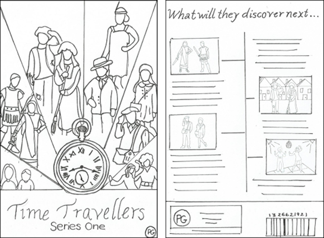
Here I have designed the DVD cover for my TV drama aimed at children, I have also analysed it to see what conventions I have followed and to explain my ideas .
Masthead/ Logo
I feel that the masthead I have included on my DVD cover is eye catching and easy for my target audience to read and recognise. I have kept the masthead simple yet effective as the DVD cover is already very busy and I don’t want to clutter it with a big bold logo from my programme. I have broken typical media conventions associated with mastheads at the top of DVD and magazine covers as I have placed it at the bottom of the cover. I decided to place the masthead at the bottom of the cover so that the main focus is on the images above this is because my target audience is young children and they tend to be drawn in more by photos rather than text, so when on the shop shelves the images are the first thing they’ll see. Finally the simple serif font highlights the historic time travelling theme to the young audience.
Target Audience
I feel that this DVD cover I have designed is clearly aimed at a younger audience, this is because of the large  images on the front to catch their attention and appeal to them . The Childish theme is carried throughout the cover as it uses large images of the characters in different time periods to show the audience what the TV programme is about. It is also clear that this DVD cover appeals to a younger target market as it contains little text when explaining episodes and instead uses corresponding mages that give the children a snapshot of the episode ahead.
Layout
The Layout used for this DVD cover follows typical media conventions for DVDs because , this magazine includes a clear masthead so that it is easy to see on the shop shelves. The DVD cover also follows conventions as it uses a photograph of the main characters which clearly highlights their personalities and the plot of the programme . This is effective as it makes the cover look appealing to its audience and gives them an insight into what is in the DVD series is about. All the episodes are listed on the back for them to see easily.
Typeface
The simple sans serif font I will be using makes the writing easy and clear for the young target audience to read. By making the font clear and easy to read allows the young audience to become independent in reading by themselves, this then allows them to become interested in the DVD and is easy for them to understand.
DVD Conventions

This DVD cover follows many media conventions that are typically seen on other DVD covers covers on shop shelves. This DVD has a clear barcode and a suitable age rating so that the audience can know what age the programme is appropriate for. On the back it also lists all the episodes the DVD includes which is a typical convention so that the viewer can clearly see what episodes the DVD includes.